PUBLISHED MAY/JUNE 2018
by
Cathi Stevenson, Owner, Book Cover Express --

Cathi Stevenson
You may think you’ve landed on the perfect book design, but that could be bias creeping in. Make sure you answer these questions before approving your cover design.
Everything is perfect. The cover is exactly— no, better than—what you envisioned. The test print went smoothly, and the colors are vibrant and eye-catching. You’re positive this cover design will help your book soar to the bestseller lists. But is it possible you’re looking at it through a biased lens and missing major issues?
Because most independent publishers depend on online sales, that little one- or two-inch thumbnail has a big job: It has to do the work of an advertisement. It has to draw the reader’s eye away from all the bright, animated images around it and entice that all-important click-through, hopefully leading to a sale. Sometimes all of this is being done on a device that itself is only a few inches wide.
While personal preferences and tastes are fine for general guidance, as a good project manager, you need to be knowledgeable about consumer trends and expectations. What are people actually buying?
The best artwork in the world won’t help sell a book if it’s not suitable for the genre.
Have You Done Your (Market) Research?
If you want to manage your own project, you’ll need to do the market research. If you don’t have the time or desire to do this, then hire a cover designer who will. There’s no sense paying for an elaborate illustration that readers won’t understand or associate with your subject matter. The tip I share with my clients is to study the bestsellers lists.
The New York Times’ lists are the most revered. These books are usually produced by publishers with big budgets. They’re setting the trends, and their design choices have been backed up with actual sales. That’s not to say you can’t be a trendsetter. Maybe a hot pink cover on a finance book is just what the market needs, but since missteps cost money, smaller publishing houses tend to be a bit conservative.
Grab a coffee and spend a few hours looking for cover trends, such as:
- Particular colors
- Symmetry
- Lack of symmetry
- Handwritten titles
- 1970s-style typefaces
- Imagery themes
- Author name position
- Mixed-media covers (including both illustration and photography)
The list is endless, and professional cover designers have been known to spend entire days studying covers online and in brick-and-mortar stores.
How Readable Is Your Cover?
At the thumbnail level, readability is the most important element on a book cover. Color, contrast, and font choice are your best tools for success in this area.

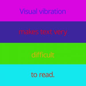
This image shows various high-saturation color combinations that create “visual vibration.”
Avoid color combinations that cause “visual vibration.” Visual vibration happens when two highly saturated colours intersect: red on dark blue, aqua on orange, pink on bright blues, etc. The result is very difficult to read or even view.
You also have to consider contrast. Light gray on white, for instance, will be difficult to discern. Brighter combinations might cause glare on a screen.
Font choice is another major factor in the success of a book cover. Your font needs to be clear, readable, and spaced well for aging eyes. Why? More than 90 percent of the population will need reading glasses after age 40. This is often due to presbyopia, a natural hardening of the eye’s lens. Even if your book is targeting children who won’t likely be affected by such conditions, parents and grandparents will still be among your potential customers.
What Fonts Work Best for People Who Have Vision Issues?

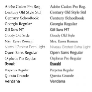
These lists show the various fonts set in 14-pt. font as they look normally and as they might look to someone who needs reading glasses.
According to The Americans with Disabilities Act (ADA), the best font choice for signs is a sans serif font with a body width that’s 60 percent of the height and a stroke width that’s 10 percent to 20 percent as wide as the height.
Thin strokes of varying width are particularly problematic. The ADA notes Garamond Semibold and Century Schoolbook as being relatively good choices for serif fonts; Bodini Book less so. For some fonts, it’s just one or two glyphs that cause the problem. Things like counter forms (the enclosed areas in letters such as e and a) can be quite small and “fill in” when read by someone with less-than-perfect vision. How do you test for this? Pop your book cover image into a graphics program like Photoshop and blur it a little. Do portions of the letters disappear or become difficult to see? Does it have an impact on your ability to read the title? Keep in mind, nothing is going to be perfect, and sometimes you might have to give up a bit in one area for the sake of a strong overall design.
Is Your Font Telling People Your Work Is Credible?
There is evidence to suggest that people judge the credibility of documents based on their fonts. That’s right, Comic Sans really can keep you out of graduate school.
In 2012, a study was conducted in
The New York Times that compared several fonts: Computer Modern, Baskerville, Georgia, Helvetica, Comic Sans, and Trebuchet. Online readers—who were unaware of the research—were asked to read an article presented in a random font from this list. Forty thousand people responded. The article, which discussed a study on optimism versus pessimism, was presented in two parts. After reading it, participants were asked to rate how believable the conclusion of the study was. Those who read the article set in Baskerville were more likely to believe the conclusion of the study, followed closely by those who read it in Georgia.
A bit less formal, but interesting all the same, was a comparison done by university student Phil Renaud. Back in 2006, Renaud discovered that fonts seemed to influence the grades he received. Renaud wrote 52 essays over several semesters, using Times New Roman, Trebuchet MS, and Georgia. When tallied, he realized that the 23 essays set in Georgia netted him an average grade of A, while the 18 done in Trebuchet MS averaged only B-minus. The remaining essays set in Times New Roman were awarded an average grade of A-minus. His conclusion was a bit more general than comparing the stroke height of individual glyphs though, and he declared, “I want to say that serifs appeal to academics more than sans-serifs do.”
Perhaps they do. The winners in
The New York Times’ experiment were both serif fonts, and the subject matter of that article was also academic. The question is, does this apply only to body text, or are book titles set in serif fonts more likely to appeal to academic readers—or all readers, for that matter?
Certainly Penguin’s classics do well with the popular sans serif typeface Gill Sans, and a quick tour of the bestsellers’ lists show that the clean smooth lines of a sans serif are still making sales. Fortunately, with book cover design, you can combine a serif with a complimentary sans serif. The life of a book project manager is filled with difficult decisions.
Are You Bordering on Image Desperation?
Last, but by no means least, make sure you didn’t use a second-rate image because you can’t find the right one. Plenty of text-only book covers make it to the bestseller lists, especially for nonfiction. We’ve all seen book covers that have clipart images stuck all over them with no cohesive style or even theme. This is where your business sense has to rule. While you might think your book needs to be adorned with a particular image or scene, it probably doesn’t. Make sure you’re creating a book readers want to buy (if your goal is sales) and not sacrificing it in the name of some unrealistic vision. If you’re tempted to hire an illustrator to create a cover that includes five characters, a car accident, a fiery jet, and a scene from a casino, it might be time to consult a professional cover designer.
Cathi Stevenson is a visual communications specialist and book cover designer with decades of experience. She previously worked as a writer and editor for a major newspaper. Cathi works extensively in publishing and corporate communications, designing book covers, and reducing 30-page documents to concise infographics, signs, and brochures. Publishers can visit Cathi’s book cover design site at bookcoverexpress.com.