PUBLISHED MAY/JUNE 2018
by Kristin Fields, Associate Editor,
IBPA Independent magazine --

Kristin Fields
You can—and should—judge a book by its cover, as book buyers do. Here are a few A/B cover options tested by the Codex Preview.
Last September, in a webinar titled “Converting Book Browsers to Book Buyers,” Peter Hildick-Smith and his firm Codex-Group shared ways that authors and publishers can navigate the increasingly difficult marketplace to entice readers to buy their books (read the full details in this
IBPA Independent article,
Converting Book Browsers to Book Buyers).
Below are three examples of cover design comparisons that highlight how book cover design plays a major role in the book-buying process. Each example is based on ongoing research into book buyer behavior and new book preferences using Codex Preview testing.

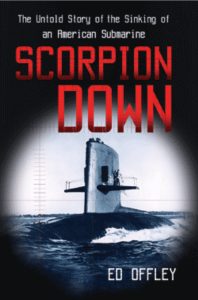
"Scorpion Down" book cover

"Shadow Divers" book cover
The strongest book messages also attract crossover readers from other categories. Both
Shadow Divers and
Scorpion Down are about submarine disasters, but
Shadow Divers’ message conveys a “mystery of the deep” story that’s strongly appealing to both men and women with a range of category interests. This helped to catapult the book to the top of the NYT bestseller list. In contrast,
Scorpion Down, featuring a military submarine image, only motivated a narrow audience of male “Military History” category fans, turning off women and other crossover readers.

Option 1

Option 2
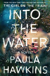
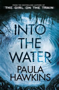
Connection matters. Only one in five readers of
The Girl on the Train knew its author’s name. So, for the author’s second book,
Into the Water, it was imperative those remaining 80 percent of
Girl on the Train readers, unfamiliar with its author’s name, clearly understand that this new book came from the bestselling author of
The Girl on the Train. The UK cover (listed as "Option 2" above) delivered that connection best, resulting in stronger browsing impact.

Option 1

Option 2
Tap into an audience’s interests. People who enjoy reading thrillers enjoy solving puzzles, too, which is why the "Option 2" cover performed better. Preview testing also shows that violent or distressing images both leave little to the reader’s imagination and can turn browsers away.
Kristin Fields is the associate editor of IBPA Independent magazine.