This is the second instalment of a two-part series about Amazon’s A+ content. The first part, “How to Use Amazon KDP A+ Content for Books,” ran in the January/February issue of this magazine.
The goal of all book marketing material is to close the sale. Amazon’s A+ content can go a long way toward achieving that goal by providing tantalizing visuals, conveying professionalism, and enhancing brand consistency.
Additionally, much like Amazon’s Look Inside the Book feature, A+ content helps to set reader expectations for your book. This is important, as you want to attract the readers most likely to enjoy your work and leave a positive review. If you inadvertently target the wrong market through unclear or misleading marketing material, you’ll wind up with unhappy readers and poor reviews—which nobody wants!
The key, therefore, is good design. Creating strong A+ content, the kind that appeals to your target market and boosts sales, takes forethought, planning, and careful execution. This article will discuss what you need to consider and how to plan your A+ design for the best possible results.
Choosing Your A+ Approach: Story-Based or Information-Based?
There are two broad approaches to designing your A+ content. While they aren’t fixed, and there’s certainly room for flexibility, it’s a good idea to first decide which approach would best serve your book. Not only will it help to narrow down layout options, but it will help to clarify the kind of content you should be prioritizing.
Story-Based
This approach will tell (or tease) a story, relying heavily upon visuals, with the goal of enticing potential readers. Text is usually present, but its role is to enhance mood or pique interest. This story-based approach has more in common with billboards and movie posters than a product brochure.
Best for these books:
- Nonfiction with a strong focus on imagery (e.g., photography and art books)
- Fiction (especially genre fiction)
- Memoirs (especially those that are more reflective and narrative-based)
- Single/standalone books
Information-Based
This approach relies more heavily upon textual information, with the goal of reassuring and convincing readers that investing in your content would be a good decision. The visuals support the text, making the textual information easier to digest. This approach is much more like designing a traditional product brochure.
Best for these books:
- Nonfiction with a strong focus on information (e.g., business, politics, self-help, educational)
- Books that are part of a series (where the additional focus on information would add understanding and context)
Note: For some book categories, like children’s books, you might find yourself torn between story-based and information-based. Story is the most immediately obvious choice; however, due to the educational nature of these books, you may want to add a little more information to your A+ content. In this case, a hybrid approach would be fine, provided your messaging is clear and uncluttered.
If you’re having a hard time deciding, ask yourself the following marketing question: Do you want to evoke an emotional response, or do you want to appeal to a reader’s intellectual curiosity and discernment? The former is better aligned with a story-based approach, and the latter with an information-based approach. If you really need elements from both, choose a hybrid approach.
General Design Priorities
You don’t need to be a graphic designer to plan strong A+ content. However, you do need some clear priorities. Before diving any deeper into strategies, here are a few things to bear in mind, no matter what direction you take.
Clarity of Message
Beautiful images, clean layout, and great copy will only do half the job if they’re not working together to convey a strong message. To help you stay on track, write down the message you want to convey before you choose images and fonts. Even better, include your target market in the message. This will help to guide and narrow your choices to the strongest options. Here are some examples:
- This cookbook delivers wholesome, rustic recipes for anyone keen to master traditional cooking methods.
- This romance is a sizzling, passionate whirlwind, set in a world of glamorous billionaires, aimed at contemporary romance readers, ages 18 to 35.
- This autobiography is a fun, tongue-in-cheek examination of a life lived with the brakes off, aimed at readers over 60.
Each of these examples should have conjured up some kind of imagery in your mind—and that’s the point! While it might be tempting to skip this step, recording your message in such a specific manner will save you a huge amount of time when it comes to creating your A+ content.
Clarity of Layout
Keep it simple! A+ content offers 17 different modules, but you’ll only need a few; between one and four is sufficient. Otherwise, you’ll overwhelm viewers and risk turning them away. There’s actually a limit of five modules per block of A+ content, so even if you wanted to go higher, you can’t.
Brand Consistency
If you’ve already embarked on a social media campaign for your book, it's a good idea to continue this branding into your A+ content. This is because there can be a visual disconnect when a reader clicks on a social media or website promotion and lands on your Amazon product page. A+ content is a great way to smooth this transition by visually repeating what they originally clicked on and reassuring them that they’re in the right place.
Quality Images
Stock images are absolutely fine, but be careful in their use; some need further editing or the application of filters to bring out their potential. If you don’t have these skills, stick with images that look professional right out of the box, or hire a photographer to take some real-world images for you.
Of course, you might already have high-quality images on hand. Check not just your marketing material, but your book’s interior; photographs, illustrations, paintings, charts, graphs, and iconography are just some examples of quality visual content that you can repurpose for A+ content.
With those general points in mind, here are the specific design strategies and how you can employ them.
Story-Based Design Strategies
Three-Part Teaser
If you want to entice readers with a compelling teaser, breaking it into three story beats is a great way to do this. You can split it into three separate images; alternatively, try a single image split into three horizontal strips, as follows:

Each horizontal strip measures 970px wide by 300px high.
Good module choices:
- Standard Image & Light Text Overlay, stacked into three rows (each image 970px wide by 300px high)
- Standard Image & Dark Text Overlay, stacked into three rows (each image 970px wide by 300px high)
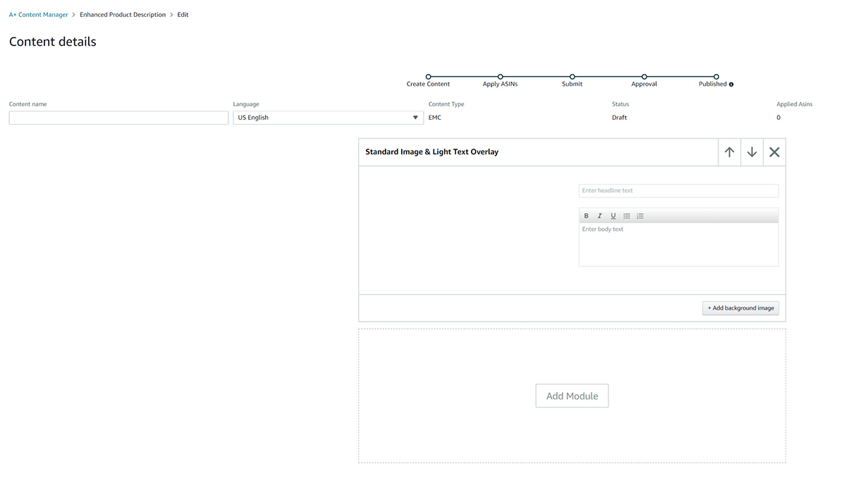
The following shows the interface you’d be presented with if you chose Standard Image & Light Text Overlay:
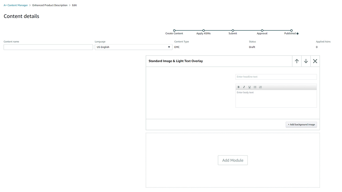
Note: For textual content, you can either use the Text Overlay feature offered by these modules or, if you want complete control over your graphics, you can embed the text within the image itself and simply ignore the Text Overlay feature.
Image Banner
If you want to use a single high-impact image in wide-landscape format, this would be a great choice. If you have promotional assets you’ve been using on social media, consider modifying them for this format. For example, repurposed Facebook Covers are well suited to this format.

This image measures 970px wide by 600px high.
Good module choice:
- Standard Image Header with Text (image 970px wide x 600px high) – shown below
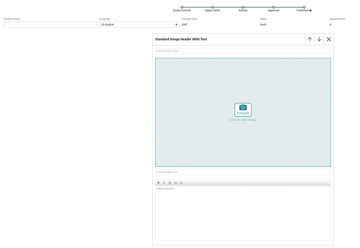
Image Collage
This is a great choice if you already have a collection of square, on-brand Instagram posts, or if you want to feature tantalizing quotes from your book in a visually interesting way.

An example of an Image Collage; each square measures 300x300px.
Good module choices:
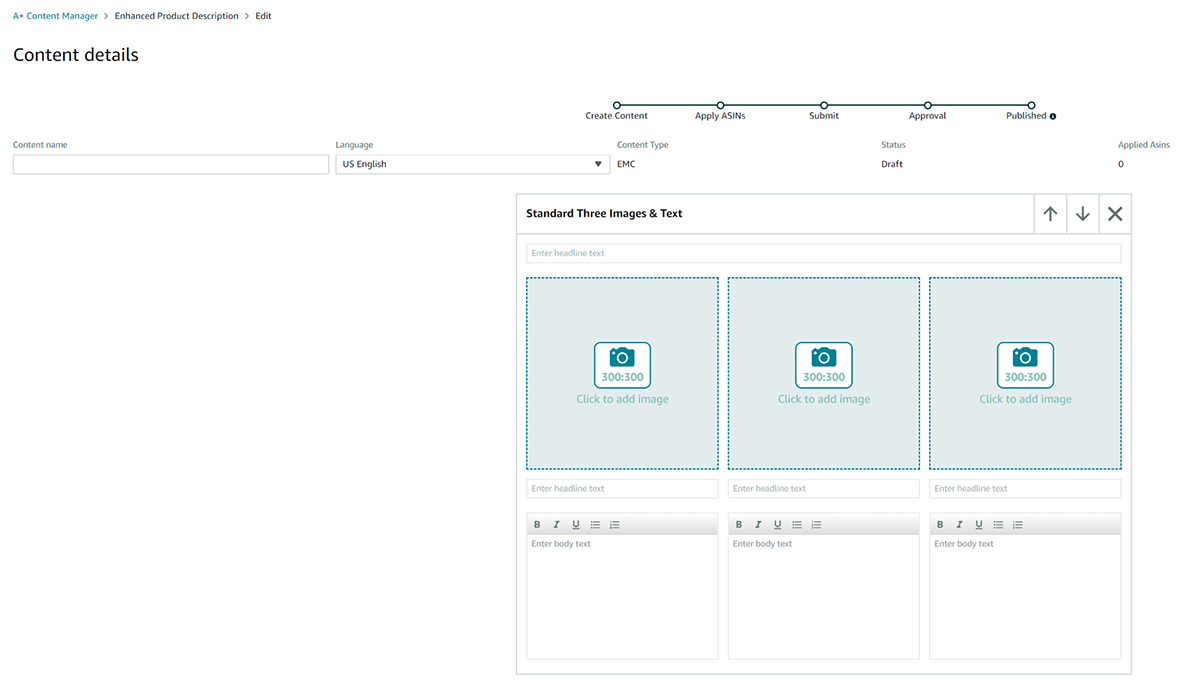
- Standard 3 Images & Text (300 x 300px each)—You can also stack modules, allowing you to create a 3-, 6-, or 9-image grid.
- Standard 4 Images & Text (220 x 220px each)—Note: These image blocks are a bit small, so unless you have a good reason not to, stick with the three-image module.
Here’s what the Standard 3 Images & Text Module looks like from the dashboard:
You can also combine variations of the above for more interesting layouts; for example, an Image Banner plus an Image Collage would work well together. Just consider why you're adding each new module, and don't overwhelm your readers with too much visual content. (This, by the way, is why there tends to be fewer modules for the story-based approach; unlike the information-based approach, there are no blocks of text to break up the visuals. Always consider the experience from the reader’s point of view.)
Information-Based Design Strategies
Because this strategy incorporates more text, it lends itself toward different modules and layouts. While A+ currently offers 17 modules, the ones listed next should be sufficient for most purposes, and they’re the easiest to implement.
Book Summary
This layout comprises a banner introduction to your book, a summary of what it’s about, and some featured content to round things out. Remember, you already have a book description at the top of your Amazon page, so try not to repeat yourself; your A+ content should add information that clarifies and entices but is in no way repetitive or redundant. Also, make sure your copy doesn’t break any of Amazon’s rules, which you can find at kdp.amazon.com/en_US/help/topic/G4WB7VPPEAREHAAD.
That said, here’s a layout breakdown, and what modules you can use:
1. Banner image (if possible, repurpose banner content from your website or social media)
Good module choices:
- Standard Image Header with Text (image 980px wide x 600px high)
- Standard Image & Light Text Overlay (970px wide by 300px high)
- Standard Image & Dark Text Overlay (970px wide by 300px high)
2. Book summary (includes an image with one to two paragraphs of text)
Good module choices:
- Standard Single Right Image (image 300 x 300px)
- Standard Single Left Image (image 300 x 300px)
3. Featured content
The featured content part is where you can get creative. You can focus on specific book highlights, spotlight key chapters, or share special content. If your book is part of a series, you can show a comparison chart. Consider what information you could give potential readers to help them understand your work better and select a module accordingly.
Good module choices:
- Standard 3 Images & Text (300 x 300px each)
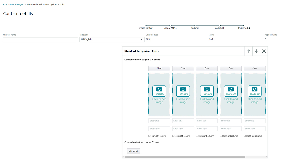
- Standard Comparison Chart (each image 150px wide by 300px high)—Note: You can add up to six books in a side-by-side comparison chart.
- Standard Image Header with Text (image 980px wide x 600px high)
- Standard Image & Light Text Overlay (970px wide by 300px high)
- Standard Image & Dark Text Overlay (970px wide by 300px high)
Here’s an example of how a four-book comparison table might be laid out:
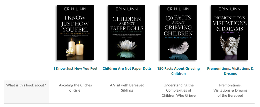
To create something like this example (obviously using your own text and covers), you’d use the Standard Comparison Chart as pictured below:
Author Bio
If the author is a subject-matter expert, an extensive author bio might be a good choice for your A+ content. You'll want to display a good-quality profile photo plus relevant credentials and biographical information.
Good module choices:
- Standard Single Right Image (image 300 x 300px)
- Standard Single Left Image (image 300 x 300px)
- Standard Single Image and Specs Detail (image 300 x 300px)
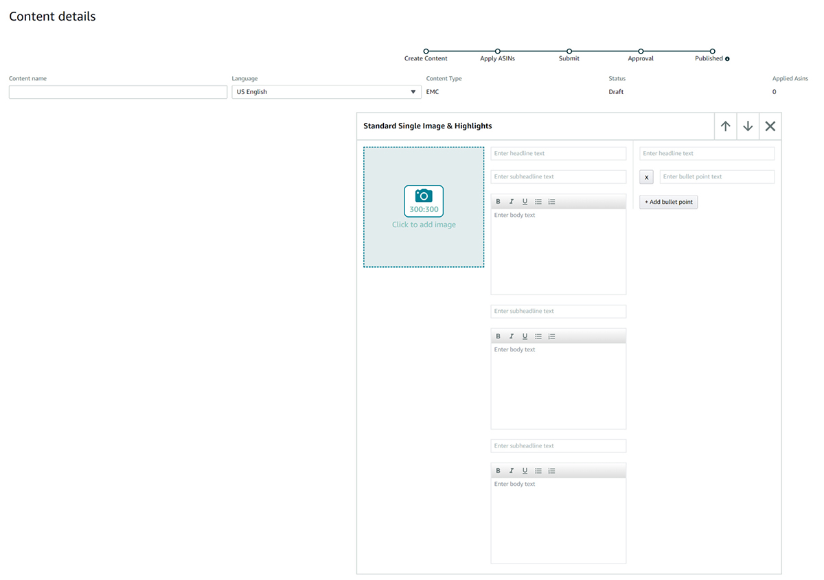
- Standard Single Image and Highlights (image 300 x 300px)
The following is a mocked-up example of a clean author bio that gives plenty of information, without being cluttered. Images sourced from pixabay.com.
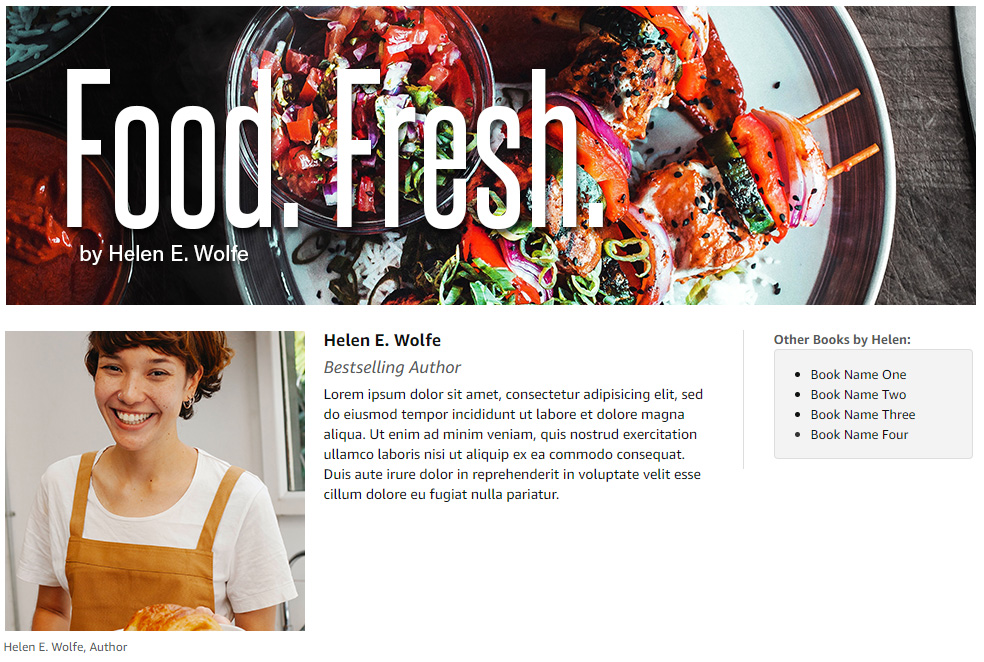
It utilizes two modules. The banner was created with Standard Image with Light Text Overlay, with text embedded in the image (i.e., not utilizing the overlay feature):
The second module was Single Image with Highlights:
Sourcing Images
Sourcing and creating the right visuals for your A+ content is arguably the most challenging and time-consuming part of the job. Hopefully, you already have multiple on-brand images that you can simply resize and reformat for your A+ content. This is not only the most efficient solution, but it also ensures brand consistency across the web. Scour your project folders for the following:
- Your book cover – If you can, get a separate copy of the background image, minus the text, so you can crop and refit it for an A+ content module.
- Book mockups – These can be paired with on-brand background imagery for strong book promotions.
- Internal images from your book – This could include illustrations, graphs, tables, maps, flourishes, title graphics—anything that’s visually interesting.
- Your website – Use any banners, book promotions, and pre-edited imagery that you’ve already created.
- Social-media headers – Use any banners, book promotions, and pre-edited imagery that you’ve already created.
- Social-media posts – Use any marketing posts you may have published on Instagram, Facebook, Pinterest, or Twitter.
If you don’t already have marketing material for your book, and you’ll be creating it from scratch, some of the above tips still apply. For example, using assets from your book cover would be a good jumping-off point. You should also explore stock images for appropriate imagery, paired with fonts that complement your book and/or brand. The key point to remember is that you’re not just picking images that you have a personal preference for; you’re appealing to a specific target market and conveying a specific message. With those guideposts in place, you’ll be able to stay on track and create solid marketing visuals.
And, of course, once you’ve created these assets for A+, it makes sense to ensure they’re published on your website and other marketing channels, again to reinforce your brand.
What’s Next?
While there are no hard-and-fast rules when it comes to A+ content, the guidelines shared in this article are a strong starting point. The most important thing to remember when designing your layout is the clarity of the message. Keep the layout clean, use quality graphics throughout, and, where possible, reinforce your book’s branding. This approach will go a long way toward convincing the right readers to buy your book.
If you’d like to see some more examples, Amazon KDP has provided some useful A+ Content design examples at tinyurl.com/Amazon-Content-Examples.
Angela Haddon is a book cover designer specializing in quality premade romance covers. She’s worked with New York Times bestselling authors, debut novelists, publishers, and successful, self-published authors to create eye-catching covers that appeal to the right reader. For more information and articles on book marketing, visit her website at angelahaddon.com. This article was originally published on AuthorImprints.com.
Learn more about this topic: