PUBLISHED JULY 2017
by Stella Otto, Author/Publisher,
The Backyard Orchardist

Stella Otto
A previous IBPA Benjamin Franklin Award™ winner receives another medal for the redesign of her original book.
If you’ve ever seen home renovation shows like "Flip This House," you know that even if the property was once beautiful and structurally sound, time often renders it out of style and harder to sell. No one wants a kitchen from the 1980s anymore. For
The Backyard Orchardist: A complete guide to growing fruit trees in the home garden, the time had come. In this article, I will discuss the decisions I made and how I went about the book’s redesign.

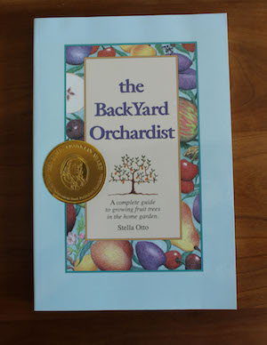
The original cover of
The Backyard Orchardist
Novice naiveté had prompted me to self-publish the first edition of
The Backyard Orchardist, pictured left, with minimal outside help. Prior experience in writing, design, and creation of newsletters helped construct this
IBPA Benjamin Franklin Award™ winner in 1994. Due to the book’s long success, I was confident that I would continue to self-publish as I approached the redesign of the latest edition. It required being a jack of many trades while also recognizing my own limitations.
Over time, the topic of
The Backyard Orchardist had evolved from growing one’s own food for mere survival, to patriotic Victory gardens, to the currently chic and trendy garden-to-table local food movement. So, too, has publishing—from quill and papyrus to e-books. The original edition had been created with old technology. Pages were laid out with WordPerfect. Self-made illustrations were hand-inked and waxed onto camera-ready laser-printed individual pages. Color separations were needed for a full-color cover.
For the current edition, I jumped from these dark-age methods to what was the accepted technology for today: InDesign and the rest of Adobe’s Creative Suite. It was a big leap.
Beyond the updates of informational content, I wanted to strengthen the design to make the book even more reader-friendly. I made a mental list of what I felt were the book’s weaknesses and strengths. Next, I pulled out the evaluation sheets I had received following the book’s entry into the IBPA Benjamin Franklin Awards™ contest all those years ago. Areas where I received the lowest scores included:
- Page layout (i.e., organization of heads, subheads, and breaks in copy) could facilitate reading better
- Cover, front, and back matter missing some essential elements
- Use of type, graphic elements, and illustrations could be more creative
These were all valid points and places to focus the redesign.
Get it Covered

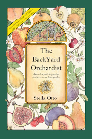
The newly redesigned cover of
The Backyard Orchardist
Let’s start with the three components of the cover: front, back, and spine. This was an area that was artistically beyond the scope of my skills. For something as visual as the cover, I wanted to deal face-to-face with the artist. I hired local artists experienced in cover design for both editions. It was one of my largest budget items, but it was money very well spent.
From the beginning, the cover of
The Backyard Orchardist did its job well. It caught peoples’ eye. For the second edition’s cover, pictured above, I considered it important to retain that successful style and feel. The original cover’s main shortcoming was that the light border tended to fade into the background. For this version, I wanted a darker border to delineate the cover. The fruit frame motif was a keeper. It did, however, get an update: the addition of some new fruit to reflect what was added to the expanded content and some new graphic touches that would be repeated in other parts of the book.
After examining many successful nonfiction books, I noticed that back cover copy has evolved from collections of favorable quotes toward more marketing-oriented copy of what the reader would learn from the book. In this fast-paced, what’s-in-it-for me world, I chose to outline the steps to success that would be detailed inside. After rewriting the back cover copy, I conferred with several marketing experts and received valuable feedback that helped tweak the final copy.
Design elements, such as the title box and an old style font, were retained in modified versions. Front cover elements were repeated and incorporated on the back cover and spine. My goal was to keep the recognizable look that had become the branding for this book and its companion,
The Backyard Berry Book.
Between the Covers
Moving from the cover to the interior, my goals remained: keep the good, improve the weaker elements, and retain the cohesion of the whole. The book deals with a topic that is a progressive, long-term endeavor. I wanted its organization to logically follow this timeline so readers could easily find and use what they needed, when they needed it. This idea was at the forefront of the design and layout of the interior. The main text was divided into chronological sections. The page footers were designed to aid navigation; verso pages indicated the section title, recto pages indicated the chapter title.
Evaluations from the original IBPA Benjamin Franklin Awards™ critiques were instrumental in reminding me of small details and publishing conventions that I had overlooked in the front and back matter of the first edition. Items, such as publisher’s address, were added to the CIP page. For easy accessibility, the table of contents included not just chapter titles, but expanded subsection listings. Due to the extensive number of illustrations and charts, they were listed along with their page numbers to make them easy for readers to locate.
I was honored by the foreword I received from a prominent horticultural historian. A wonderful addition to the front matter, it offers the reader a view into why the book’s topic is timeless. A brief quote from this foreword became part of the back cover design with the intent of enticing the reader further. Finally, retaining the personal touch that was meant to be a part of the book’s feel, the original preface was redesigned as a short “note to readers.” I hoped to again encourage a new generation of readers that they could succeed at this sometimes daunting hobby.
Meeting my goal for cohesion was the most difficult to accomplish with the back matter. By its nature, content of back matter can be diverse and hard to unify. Included in
The Backyard Orchardist back matter were an appendix, glossary, and index. The glossary and index were improved upon primarily by creating a more consistent style that mirrored the section headings of the main body of text: a larger font point size and bold letter for each alphabetical division. The appendix—which included an infographic, to-do checklist, troubleshooting Q&A, resource section, and useful conversion formulas—would prove to be a greater hurdle. In the end, I decided to allow some of those items to have their own standalone styles, while others followed the text and heading styles as closely as possible. My primary questions in each case were, “How will this component be used by the reader, and how can I make that easiest for them to access?”
The Body
The main body of the book—the text, charts, and illustrations—was the easiest to design. I created a page layout based loosely on a six-column grid. This would maintain consistency across the various elements and allow efficient use of chart space. However, I was not a slave to the grid and made an occasional exception.

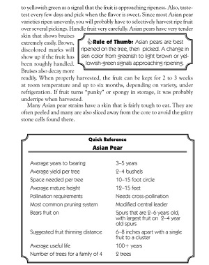
The interior copy of the redesigned
The Backyard Orchardist
To accommodate current-day reading styles, the redesigned text portion was broken into smaller subsections with more frequent headings than had existed in the original edition. I have noticed more books using sans serif fonts. Personally, I find them harder for my aging eyes to read. Since a good percentage of my market is the retiree age, I stuck with a serif font for the main text and its bold or italic variants for headings and captions. A sans serif font was used sparingly to contrast and call attention to small areas of text, such as charts or callout boxes.
A graphic element I nicknamed ROT (Rule of Thumb) boxes was added to the redesigned edition. Their intent was to reinforce key concepts and make those concepts very easy and quick to find. To set them off from the charts, their scalloped corner design mimicked the cover’s title box.
Finally, I am often asked, “Why illustrations; why not photos?” Number one, stock photos of the specialized insects and some of the horticultural practices I needed to show are extremely hard to obtain. I did not have the large budget for a professional photographer, nor the skill to take my own high-quality photos. Getting a truly good photo of many of the subjects could take a large dose of sheer luck and days of waiting for them to appear at just the right place and time. Photos were neither a time- nor cost-effective endeavor. The artist who created the cover specialized in nature illustrations. Working together, from my original illustrations, he was able to produce the high quality and detail that proved to be my best solution.
As I wrapped up the redesign, I asked myself, one last time, that most important question: “Have I made this book as useful as possible for my reader?”

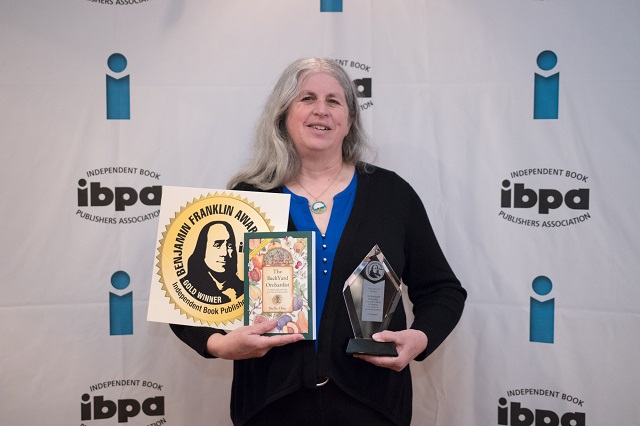
Stella Otto accepts a Gold IBPA Benjamin Franklin Award™ on April 7, 2017 for
The Backyard Orchardist in the category of BEST REDESIGN.
Stella Otto honed her writing and design skills producing newsletters for the farm market she and her husband owned. With a degree in horticulture, she publishes information on fruit growing for home gardeners. Her lead title, The Backyard Orchardist,
has been the winner of two gold and three silver IBPA Benjamin Franklin Awards™.