PUBLISHED JUNE 2017
by Ebonye Gussine Wilkins, Founder, August Rose Press
 Ebonye Gussine Wilkins
Paying rapt attention to readability, the inside cover details, and overall branding will bring you closer to snagging a big win for your book.
In early April,
IBPA ushered in a new cohort of award-winning indie books via the annual
IBPA Benjamin Franklin Award™ program. Always a festive occasion, it offers up a time to celebrate the best work produced by IBPA members and honor their dedication to indie publishing standards.
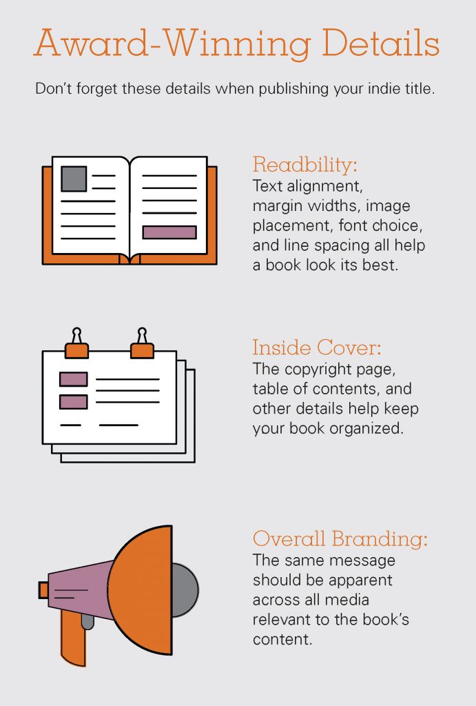
But, when so many beautiful, carefully crafted books are published each year how does one become a shining star in the indie publishing community? Well, it’s a good news/bad news scenario. Bad news: It’s in the details. Good news: Figuring out the details is not an insurmountable task. Producing an award-winning book is a lot easier now than decades before. Paying attention to readability, the inside cover details, and overall branding will bring you closer to snagging a big win for your book.
The interesting thing is, readability, the inside cover, and overall branding are the invisible pillars that help make a book stand out. (By blending in, a book stands out. Go figure.) These are the details that don’t seem obvious if they are there but, when not factored in, the difference is striking.
 Readability:
 This means that the inside of your book needs to be clean, sharp, and professional. This covers a lot of items and can vary depending on the content, but the readability of a book makes it easy for the reader to get lost in the content and not hung up on the details. Is the font precise and clean with good contrast? In many cases, a serif font is a great choice for large bodies of text. The alignment of the text (left, right, justified) and the size of the font also makes a difference. Headings should be used consistently, and bolds and italics should be used sparingly (if many things are bolded or italicized, it’s hard for a reader to tell what is the most important piece). Wide margins can also lend to an uncluttered look. All these little factors can help or hinder readability. Make sure a book designer handles this part (or at the very least reviews it) so you can avoid easily overlooked errors. A book that doesn’t get read because of interior formatting mistakes won’t likely win an award.
Inside Cover: I like to refer to this as the “housekeeping” pages, but you might know it as the copyright page. It lets you know who made the book, where and when it was published, how the book should be categorized, and any other details that are necessary to make sure that credits are given and permissions can be requested. While most people won’t bother to read that page, anyone who needs that information (or wants to check if the book is the real deal) will look for that page. Make sure it is accurate. Readers may want to know if there are different formats to the book and librarians may want to know how they should categorize the book without reading it first. If your book is digital only, make sure that the relevant information is included in the metadata and other relevant keywords to aid in discoverability for your book. You can fill in those details on Bowker, where you’ve purchased your ISBN. While the copyright page isn’t the only before-the-book-begins page to look out for, it is an incredibly important one. As an indie publisher, your products will be judged on how they compare to traditionally published books, so this is one of the details that will help you get it right.
Overall Branding: This can be the most fun part, but it can also be the hardest! This includes the book cover as well as marketing materials, blurbs, elevator pitches, and website content. Think about the overall message that your book is sending to your potential reader. The overall branding cannot be influenced solely by the cover design. Every aspect of your book branding must be cohesive. This way, no matter what media your potential reader comes across (hint: it won’t always be the book first, it could be a press release or a video) they will know and understand what the book is about and why they might want to purchase it, read it, and recommend it. The same message must come across on all relevant media. Don’t give someone the opportunity to walk away from your book because they couldn’t get what it was about at a glance. Give them the information they need quickly so that they can know the book is for them or at least want to learn more about it. Stacy Atkinson of Mirror Image Publishing won a 2014 Benjamin Franklin Award for her book Stuck. Not only did she win a silver award for the improved cover design, but the image of the book’s protagonist was reflected in the water on the book cover’s design. The cover not only gave an idea of the themes of the book, but was also a subtle nod at the publishing company. Cohesion matters; use it to your book’s advantage.
While these tips won’t necessarily guarantee your next indie book publishing award, it will help you and your book garner considerable respect. While mostly invisible to the readers, these critical details will get your book noticed.
>>> The annual IBPA Benjamin Franklin Award™ program accepts entries through December 15th of each year. Click here for details. <<<
Ebonye Gussine Wilkins is a social justice writer, editor, author, and founder of August Rose Press (augustrosepress.com).